Following on from an earlier post, here's more on our renovations.
Downstairs, or the reception rooms is where the majority of the heavy work was done.
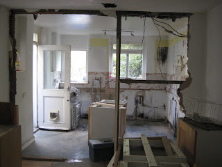
Originally it was four rooms - living room, dining room (or study, as the vendors had it), breakfast room and kitchen. The kitchen was pretty small and dark. I later discovered that the kitchen would originally have been three rooms - a (very) small kitchen, a pantry and an outside toilet - that had been knocked into one. But for us, it was still too pokey, so we decided to knock the wall between the kitchen and the neighbouring breakfast room down to create one large room.
 |
| The original kitchen |
 |
| The breakfast room |
 |
| The work in progress! |
It faces north, so I was concerned about light in the room and opted to go for light units and light wall tiles. Not a common combination these days, but we'd seen a very similar kitchen in New York and it looked great. It was MUCH smaller and also had light floors and work surfaces, but we decided to go for a bit of contrast to vary things a little and chose a wooden work surface (which hopefully reflects the floor boards in one half of the room). We decided that the 'work' end of the new kitchen, which had been the original kitchen, would have a tiled floor and that way we would also 'show' a little of the house's history by delineating the two rooms we'd knocked into one.
If you've been reading this blog for a while, you will know that one of the earliest 'house' posts was about the blinds I made for the kitchen, which were recently altered to suit the new windows installed last spring, so it now looks like this.

No comments:
Post a Comment